
SOLVING PROBLEMS
Rationale
This part of this presentation is about Solving Problems. Solving Problems is the second component of the Program Learning Outcome (PLO’s) as part of the MFA at full sail university. This portion of the Thesis: will define the design problem and present a design solution.
Content
-
Defining Design Problem
-
Presenting Design Solution
-
Logo
-
Ideation
-
Preparation
-
Incubation
-
Focus on one thing
-
-
Illumination
-
Verification
-
Make it relevant
-
Aim for distinction
-
Keep it simple
-
-
-
Refinements
-
Vector production
-
Vector Evaluation
-
Line
-
Proximity
-
-
Semiotics
-
Color
-
Iterations
-
-
Media Applications
-
Uniforms
-
Swag
-
Defining Design Problem
Presenting Design Solution
Las Vegas Enforcers - LVE, formerly known as Las Vegas Wranglers was disbanded in the past due to a low attendance and after showing an unsuccessful franchise history. Despite the fact, the stakeholders and investors still have an interest in reviving the sport and to make it more appealing to the Las Vegas area, to make a more competitive team and to develop a brand that communicates a new spirit in a post-Covid era.
1.Design a mission statement to communicate a consistent message to share spirit of the team that will lead to create interest and commitment from the fanbase to create stronger ties to connect and engage meaningfully with the community, maintain a steady attendance and increase sales.
2.Design a Brand Identity that will include Brand Communications framework to communicate the mission statement through a Onlyness Statement that will function as a guide for listing target audience’s needs, differentiation, and positioning of the brand in the Marketplace, Voice, and Tone to express a consistent message and Look and Feel to ensure cohesive pieces of identity with a successful application across media.
Logo
Ideation
The Logo is the most prominent part of a brand’s visual identity. The development process of this design solution refers to the four principles of ideation presented on the (Baldowski, 2022a) and uses four elements of design (Airey, 2009) while using the sketching technique to provide an effective design solution.

01
Preparation
The first part was to start sketching ideas using the hockey stick as a reference, with the possibility of creating the letters with the hockey sticks.

02
Incubation
Focus on one thing
When sketching these logos ideas, the reference used was the number 7. Las Vegas is known for being a major casino resort city, slots machines being one of the gambling alternatives in the casinos.
03
Illumination
To make these ideas cohesively connected and make the final logo relevant, the Divergent thinking was necessary. Looking in different directions for new or alternatives ideas aiming for an original and relevant solution (Baldowski, 2022b, 2:53 Time).


04
Verification
Make it relevant
After analyzing the competitor’s logos and studying the shapes there were similarities in the shapes of their logos. The final decision must include a shape to stay relevant to assure that this logo falls under the same category and avoid designing a logo that do no fits well when put next to others. The design must be relevant to the industry, the client, and the audience (Airey, 2009, Chapter 3 section).
Aim for distinction
After reviewing the competitor’s logos and analyzing the shapes there was not a single logo with a rink’s shape. There were similar shapes but there was none with the exact shape of a hockey rink.
Keep it Simple
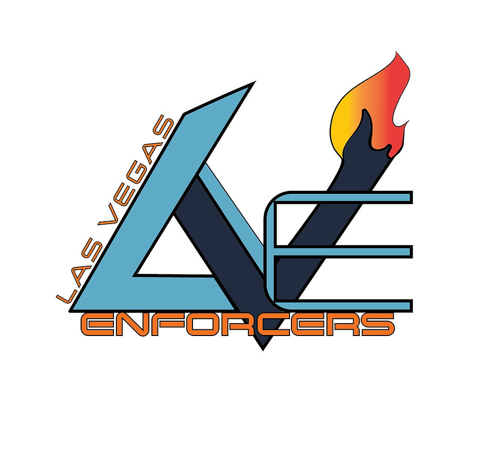
The idea of using a minimalistic approach and shortening the team’s name using the acronym LVE not only establishes differentiation, but it also gives simplicity to the name. Since the beginning of the process the decision of using the acronym LVE for the logo was established allowing the development process to start off using the seven as a reference.
Although LVE does not have an established reputation, the acronym is a form of differentiation and represents unity. By focusing on community and family, the acronym works as a nickname for visual purposes, recognition, and differentiation. Adopting a minimalist approach enables your logo to be used across a wide range of media while taking size into consideration. (Airey, 2009, Chapter 3 section). Nicknames are not used on strangers. There must be a certain level of trust, intimacy, and acquaintance to use a nickname on somebody else. The usage of the acronym LVE was properly established on the brand narrative. It functions as a branding strategy to communicate the brand’s message and stand out from the competition.


Refinements
These refinements capture the idea, and it does fit the goal of the brand. This idea was presented using the right elements and principles. This solution was focus on The Spirit of the Enforcers to create a level of trust, intimacy, and acquaintance with the community while stays true to brand’s core attributes which are spirit and unity.


Vector Production
This process consisted of self- evaluating previous logo sketches, then vectorize them on Adobe Illustrator to continue with the refinement process while applying design concepts, design elements and design principles such as: line, color, unity, and proximity. This process also consisted in experimenting with different ideas until a strong potential final logo design has been created. The first step was to produce the sketches into logo in vector on Adobe Illustrator. This part of the process used previous refined sketches to guide the production of the vector. The idea was to create a logo that communicates a specific message to a specific audience.

Vector Evaluation
This step was to carefully self-evaluate the six different logo concepts produced on Adobe Illustrator. The evaluation process included information such as: strengths and weaknesses, line quality and its characteristics, considered the target audience, brand message and possible errors found (Charlotte Jirousek, 1995). The idea of this part of the process was to continue testing and experimenting with the logo concepts to finally take the proper direction with the design until there is a strong potential final logo. This mark ups page contains information of the self-evaluation process to continue refining this logo and narrow down the ideas.

The decision here was to elongate the letter L to gives balance and proportion to the design.

Doing the L as the same size as the V and E makes the design cluster and harder to read. Also, by shortening the L makes it look more like a boomerang instead of emulating the shape and size of a hockey stick. the E did not connect the same way all the letters were connected on the other logos. The curve on the E does not communicate confidence and does not look like and E.

The E has a curvilinear shape but the space between the V and the E does not reflect and communicate the aspect of unity that The Spirit of the Enforcers wants to bring. The curved line on this logos makes the logo a too soft approach and goes away from the intensity and nature of the hockey sport.

Although the V and the E are together, the guidelines presented on the look and feel represents the marks of the skates on the ice. This design does not follow those guidelines.

The decision of using diagonal lines instead of a curved line provides consistency on the brand’s message.

The decision of including a flame on this logo, pretends to use the flame icon to represent the theme of this brand. This logo was the first one where the flame was incorporated as part of the logo to communicate The Spirit of the Enforcers. The L also has a curve that imitates the flame to establish a connection between them two. Another decision was to do not fill the flame to be able to put color on the flame when adding color to the logo.

The logo pretends to convey those attributes to meet and surpass consumers’ expectations. The purpose of this logo was for the audience to associate this logo with the brand to eventually identify it. Identifying the logo is not only recognizing a wordmark or an icon. The set of emotions caused on the audience it is also related to the recognition part and job of the logo. After evaluating the vectors produced, the top three logos were selected to narrow down the options and keep the three strongest concepts.
In the case of this brand, a spirit focus on unity and fearless attitude were two important aspects that needed to be emphasized on the process of designing the logo. A logo that is well designed becomes a visual shortcut for the meanings associated with it, and hence influences its viewers (consumers) to receive the brand message with its emotional effects. The logo must exist by itself and trigger, in the consumers’ minds, the whole host of emotions and images that the company represents (Cowin & Matusitz, 2011).

Las Vegas Enforcers - LVE - top 3 vectors after evaluation
Usability Test
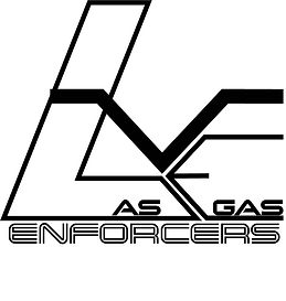
After showing this vector to a group of 15 people, their feedback was mostly on the lack of readability, and it created a confusion with the flame and the word GAS making them to think it was a fuel company instead of a hockey team. The problem encountered was that the audience was not able to read the brand’s name. They were reading “LAS GAS” instead of “Las Vegas”. That was the main problem with that design. This design did not solve the problem; it created another one.The lack of readability does not benefit the brand identity and its recognition from the targeted audience.
The theme was intended to be communicated through the logo in a metaphorical way, but the viewers were mistakenly associating the flame on the logo and the word GAS with a fuel company instead of a hockey team.The personality of this brand should always be confident and captivating. The flame represents The Spirit of the Enforcers and the decision of adding the flame to the design was to communicate the theme and message in a strong, confident, captivating, and effective way. The purpose of a logo is to identify a brand. The message of the logo indicates the statement of a promise to shape the expectation of the consumer (Cowin & Matusitz, 2011). This source supports decision of adding the flame back to the design to indicate that statement of the promise to shape the consumers’ expectation.

This organization is wholeheartedly committed to its local communities and the narrative for LVE is about empowering their fans through its spirit, words and actions. Therefore, the impact both visual and verbal are equally important. A line is auseful and versatile graphic device that is made to function in both visual and verbal ways. It can act as a symbolic language, or it can communicate emotion through its character and direction (Charlotte Jirousek, 1995).
Lines also fill few roles in design (Howard Bear, 2021).
-
Texturize - by using specific types of lines to suggest or simulate a rough or smooth texture.
-
Guide the eye - by using lines as arrows or in other ways that lead the eye to certain parts of the page.
-
Provide movement - with wavy lines that suggest moving water or vary line thickness to create an illusion of shape and movement.
Line
The personality of the brand is fearlessness and relentless, the proper usage of line direction did support those decisions. Diagonal lines suggest a feeling of movement or direction and to indicate depth, an illusion of perspective that pulls the viewer into the picture-creating an illusion of a space. Diagonal lines can be used if a feeling of activity, movement or speed is desired (Charlotte Jirousek, 1995). After evaluating the top three logos, the element of line and synthesize the information determined how appropriate these decisions are and the effectiveness of this design. When evaluating the first logo and comparing it with the other two, the characteristic of the line expresses a particular message and suggest a feeling of movement.


Semiotics
During the self-evaluation process of developing this logo, the idea of removing the flame was contemplated, but removing the flame did not align with the brand’s message. This design allowed the usage of line as a design element and the flame as an icon to communicate the spirit attribute and connect with the audience on an emotional level. A brand of cultural anthropology which looks at the use of signs and symbols as a means of communicating and conveying meaning, semiotics is a vital discipline in the science of marketing communications, advertising, and branding (Content Marketing, 2012). The purpose of including the flame was to use semiotics as a communication strategy, using fire as a signifier and the idea of spirit as signified.
The stylization of the flame has a more gentle and soft curved line the fire gives a smoother texture and provides a more personal approach. The smooth texture of the fire has a more personal approach. Although this is a rough sport and the brand’s personality is fearless, the brand is also about local communities and family and the good health of the athletes. The fire represents The Spirit of the Enforcers, and it was an opportunity to add a more delicate approach on the flame’s texture. Using lines to communicate the unity as a team, and the flame as a signifier could communicate certain messaging elements without affecting its legibility.


Color
The decision of combining both colors in the same color palette pretends to convey its literal connection between the sport and the cold temperatures while demonstrating pride by using the state color. Blue conveys feelings of strength, dependability, and tranquility (Psychology of Color in Logo Design, 2020). Blue communicates professionalism while orange to conveys brand’s characteristics which are confident and intelligent, expressed with energy and excitement.
The two main purposes of using orange are to communicate the brand’s personality and to guide the viewer’s eye to know specifically where to read. Orange is a color that doesn’t let anyone pass by without looking. Its purpose is to stands out in a crowd and communicate the fearless attribute of this brand message (Psychology of Color in Logo Design, 2020). Orange was also used to create hierarchy using contrast to be more eye-catching and stand out from the competition.


Iterations

1
This picture shows the LVE is found on the 7 and probably most of the people are not able to see the letter on that number.

4
The selections needed to be narrowed down and select the strongest logos out of those 16.Some of these sketches included the acronym inside of a rink which allowed the sketching process to continue its development.

7
The idea of eliminating the flame was contemplated but did not fit the brand’s message of spirit.

2
On this final logo the decision of modifying the flame was an effort to add some sort of separation between the letters.

5
After selecting the strongest logos, there was necessary to continue the refining process have a clear and neat sketch with specifications, clear space, and size.

8
The letters are together to represent the unity that the team is trying to convey but with this modification the flame is not on top of the E like it was before.

3

6
This version of the logo AS GAS was incorporated inside of the letters which cause confusion on the audience. That problem led to the decision of placing the Las Vegas next to the L to allow the viewer clearly to read the text.

9
In this logo the letters needed to be placed strategically to go behind and in front of each other to add a sense of perspective and proportion. The lower part of the L goes behind the V and the top left corner of the V goes behind of the L while the E is in front of the V.


Media Applications
Uniforms
The information found support the decisions made during the media assets production process. In the early 40’s the NHL required the usage of high contrast colors. They were initially used during black and white broadcast to create distinction between the teams. The NHL required each team should wear contrasting colors to make it easier for viewers to distinguish the teams during the black and white broadcasts. The home team would wear dark, the visitor white (Writers, 2022).
Knowing the history of the use of color in the NHL, and the previous mistakes done were used as inspiration and as reference to differentiate this brand from the competition. “Toronto’s game in Chicago on February 26, 1978, the names appeared on the Leaf’s blue jersey in blue, making them unreadable. The next day the league changed the wording of the rule, to stipulate the names must be in a color opposite to the color of the jersey. The Leaf’s then began using a contrasting color as the rest of the league.” (Writers, 2022) This information was relevant since the sketching part of this process to be effectively executed. This also solved a possible problem of lack of readability if the proper colors were not selected to create contrast for distinction. In 2003, the NHL switched the jersey scheme, so that the home teams started wearing their dark jerseys. In present time, black and white broadcasting is not a problem anymore. However, knowing vital information allowed the decisions to be more carefully utilized not only by doing literature review but also being strategic and branding oriented. During playoff time the home team is no longer wearing white since television is no longer in black and white (Balint, 2010) . However, teams still switching their uniforms using different color scheme depending on where they are playing. That information supports the decision of designing three different uniforms to be used as home, away and during playoffs.


Swag
Retail was always present throughout the design process as an opportunity for extra revenue. “It’s no surprise what prompted the switch. Teams were looking for more revenue, and manufacturing “third” jerseys seemed to be the easiest way to go. Teams would wear these alternate jerseys every so often at home games, giving the fans something new to look at, and hopefully purchase (Balint, 2010). These design decisions give the brand opportunities to leverage their sales, increase profit and give the fans more alternatives for them to buy and increase brand loyalty.
Also, a significant number of attendees bring their families, with as many as 30% of ticketing for children under 14. The decision of incorporating these colors was a result of recognizing the opportunity of increasing sales and capitalizing by considering this 30% and designing media assets for each specific demographic within the target audience. Nurturing a consistent relationship with customers and users, a brand begins to build influence, which, in turn, becomes brand loyalty. Brand loyalty and trust occur when your consumer is loyal to your brand, not simply the products (Paun, 2019). Merchandise giveaways was an opportunity presented to have more alternatives and maximize this opportunity. Designing multiple assets allows the brand to have different alternatives for merch giveaways.


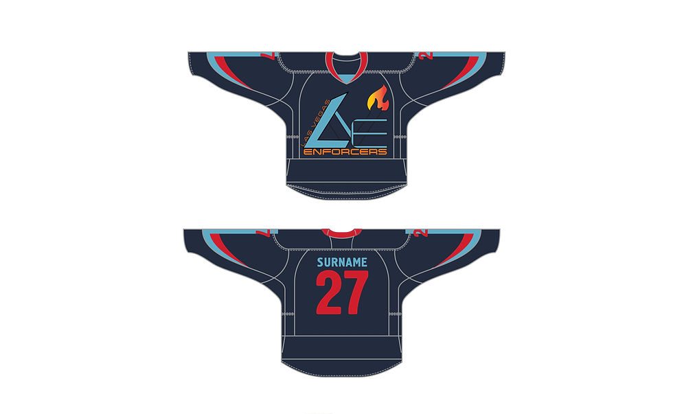
Las Vegas Enforcers - LVE - Media assets - Swag


Las Vegas Enforcers - LVE - Brand Playbook
Las Vegas Enforcers - LVE - Logo Animation
